Campus Loan Interviews

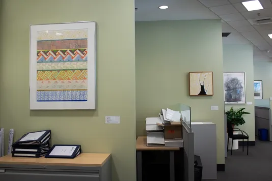
Through our Campus Loan Art Program, we are able to make artwork from our Permanent Collection available to administration, faculty, and staff offices.

Faculty and staff participating in the Campus Loan Art Program  hang artwork borrowed from the collection in their office or shared office spaces. Hear from participants about how the artwork impacted them and their space. 

Interested in sharing your story about living with work from the Campus Loan Collection?

mitlistarts [at] mit.edu (Contact Us)

Sasha Rollinger
Program Manager for MIT Gov/Lab

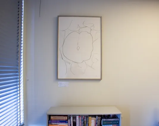
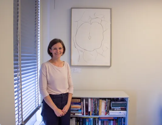
Ellsworth Kelly, Melon Leaf, 1964-66

How did you first hear about the Campus Loan Program?

I’ve known about this program for a while now. This is the third piece that I’ve ‘lived’ with. I probably found out about it through following on social media and knowing it was available for students and then finding out it was also an option for staff if they had a locked office. 

Do you recall what pieces you had in your office before?

I had a Berenice Abbott photograph of New York and before that I had a very beige piece by Robert Ryman. MIT gives you office space and the walls are blank so it’s an awesome opportunity to put something on your walls from the collection.

What drew you to select Melon Leaf this time?

Definitely the artist Ellsworth Kelly. Before coming to MIT, I worked at the Whitney Museum and we often showed Kelly’s work. So when I saw this, I knew exactly what it was. Also, a few years ago, there was an exhibition of Kelly’s drawings at the Berkshire Botanical Gardens. I fell in love with [the drawings] and as soon as I saw this piece, I knew that was the one for me. 

My son is actually named for Mr. Kelly. His name is Ellis. My family has a tradition of naming after artists. I’m not, but my brother is named after Alexander Calder. We wanted to continue the tradition. 

How did you decide where to hang the artwork?

There were not a ton of options in my office given the way it is arranged. It made for a good Zoom background above the bookshelf. 

Have you got any comments on the artwork?

Everybody who comes into my office asks me about it. They usually say ‘that’s so cool!’ I always mention the Campus Loan Program and I think I have gotten a lot of other people involved! 

What have you noticed, if anything, about the artwork since you have been living with it?

I love the free handed nature of the piece. It almost seems like drawing from memory as opposed to drawing from real life. I love the spontaneity of it. 

I spend time in Western Mass where I grow a lot of things. Although we haven’t grown these melons, we’ve tried watermelons and that is exactly what they look like! Once you know what it is, you’re like, ‘oh, of course!’ 

Sasha Rollinger is the Program Manager for MIT Gov/Lab. Previously, she served as the Membership Manager for the Norman B. Leventhal Center for Advanced Urbanism at MIT, with a focus on research administration and support for large-scale, multidisciplinary urbanism projects. Prior to joining the Gov/Lab staff, she spent a decade working in fundraising and membership roles for arts and culture institutions, including the Whitney Museum of American Art, the Museum of Arts and Design, Henry Street Settlement, and the Philadelphia Museum of Art. Sasha holds an MA in Art Business from the University of Manchester via Sotheby’s Institute of Art (New York), a BA in Communications from the University of Pennsylvania, and a graduate certificate from Harvard Extension School in Corporate Sustainability and Innovation. Sasha serves as the fundraising co-chair for the Somerville Community Growing Center.

Cory Ventres-Pake
Senior Innovation Strategist for MIT Gov/Lab

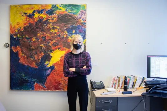
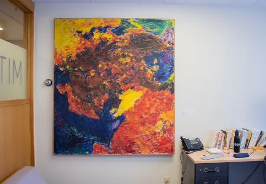
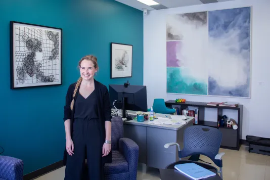
Felix Pasilis, Icarus, 1960

How did you hear about the Campus Loan Program?

My colleague Sasha, who is next door, told me about it. I was also a student here at MIT and knew that students could borrow artwork. 

Now that you’ve gotten to participate in finally having a piece from the collection for yourself, what drew you to this particular piece?

The color! I knew I wanted something bright and big so I picked the two biggest pieces in the collection and then I sent them to my colleague Carlos Centeno and he said he liked this one. 

Did you know who this artist was before?

No, I know nothing about art. Carlos always asks me what I see in the painting. I usually see an upside down wolf and a rooster. 

What have you noticed about the artwork since spending more time with it?

Honestly, it makes my office so much happier. We got this office right before the pandemic and there were grand plans for it, but those plans haven’t panned out as expected. When we got here, the office was a bit dreary because nothing had been done to it. Having this piece really changed everything in the space. 

Cory Ventres-Pake is the Senior Innovation Strategist for MIT Gov/Lab. Cory wants to lead the change in international development by shaping and managing the innovation process that will establish an environment which fully embraces human-centered design. She has a Master’s in Development Studies from the Graduate Institute of International and Development Studies, as well as a Bachelor of Arts in Economics from Mount Holyoke College.

Samantha Keogh 
Koch Institute for Integrative Cancer Research

14 Artworks

Pictured

Left: Luis Molinari-Flores, Untitled (From The Ten Downtown Portfolio), 1970 

Right: Joyce Kozloff, Mitla, 1974

Victor Matthews, Untitled, 1989

Jim Dine, Celebration 1981 (Museum of Fine Arts Boston), 1981

You are fortunate to have fourteen pieces in your office! How did you come to borrowing these pieces from the collection? 

The borrowing process was definitely spread out. This building is a little over 10 years old, and when it was completed, they got a round of artwork installed. That was when I was new to this position. I am a visual artist, so my boss invited me to work on replacing and selecting new artwork for the space. 

Before Covid, we went through and picked out about half of the pieces that we wanted and then Covid hit so none of it got installed, but Lisa and the List were so kind to hold it until after [we could return to our offices.] Then, we got half installed and because of the timing with Covid, we were pleased to discover so many works had become available. We thought it would take us longer to identify the second half of the works but then we ended up just finding a lot of really great fits.

So it took two rounds of picking out the pieces. How did you and your boss decide on the work each time?

We knew we wanted a variety. The artworks here before were beautiful, but it was very clear that they were chosen to be more basic and contemporary shapes and colors. It was all kind of in the same genre which was perfect for a brand new office. We decided that the purpose was not to just have things on the wall but to have things that different people in the office would enjoy. 

We definitely prioritized different types of artwork. We have some photographs, some contemporary works, and lots of different styles within that. We also wanted to prioritize different artists. We wanted to make sure we had women and men and different minorities represented.

My boss and I would start by saying what pieces jumped out at us and then I would tell Lisa and she would send us the information and I would go through the artist and ask ‘ok is this a variety?’ We also took into consideration the group dynamic of different areas of the office. That was hard to do because there are so many different opinions and not everyone is necessarily invested one way or the other. We tried as much as possible to match the different areas with artwork we thought that they would like.

Do any of these pieces relate to the work that is done at the Koch Institute? 

For the most part, it is more personal to the groups of people here. As someone who intentionally wants to see things in art I will sometimes think ‘‘yeah this kind of looks like a cell’ because we do a lot of biology and engineering here.

The Koch Institute has a lot of different scientific disciplines that come together. Having artwork that reflects all different kinds of disciplines coming together adds to the integrative atmosphere that we promote. 
How did you decide where to put the artwork?

We did a bit of planning, but a lot of it was replacing what was already there. There were a couple places—like in this hallway there—where two pieces were previously hung, but this hallway is so narrow that nobody looks at them. So we just decided to have the pieces there taken down and not put any artwork there. We thought it was not respectful to the artwork or artist to be somewhere where nobody looks.

There was an element of curation like not only what other people like but for example we have all these little walls that jet out so making sure the flow of the artwork was good there was something that my boss and I worked together on. 

Were there any artists or artworks that really stood out to you as you were researching the pieces to choose?

There was a funny incident that stands out to me. There was a piece we were looking at that we didn’t end up getting. We were looking at it and really liked it. We liked the lines and colors and flow so we sent an email to Lisa and asked if it was available and she sent me back the artist information. I looked at the title and the artwork is called The Cigarette or something like that. 

We went back and looked at it and it was a huge drawing of a cigarette and we were like that’s so funny, had she not sent me that title, I would have just kept seeing it one way. It would have not been ok if we put up a cigarette in a cancer research institute. Once I knew what it was, it was so obvious which is what I just love about art. It was more of a funny anecdote but we still talk about it. People will be like ‘remember when you guys almost put up a cigarette.’

Out of the artworks in the office, do you have any favorites?

Yes, there’s one in particular, it is Curled Yellow Figure (2002) by Robert Mangold. Actually, that one was hanging in the office originally and I asked Lisa if we could keep it but move it to the wall behind my old desk. It’s just the  most cheerful, wonderful, simple piece. So I got it moved where a lot of our employees can see it now. 

We have a lot of really cool pieces. We have some sculptural pieces that really add to conversation and people notice them. We have a really cool piece that is from an artist who does really long cross country walks. He takes photos on the walks so it's two photos that compliment each other. It’s beautiful and reading about the artist and his experience walking was fascinating.

Samantha Keogh is the Human Resources Representative for the MIT Koch Institute for Integrative Cancer Research. Samantha is also a freelance artist who writes, creates protest paintings, and works in theater art focusing on performance, dramaturgy, and props design. Previously, she worked at the Lower East Side Tenement Museum. 

Tess Smidt
Assistant Professor of Electrical Engineering and Computer Science

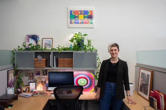
Andrew Tavarelli, Bike Painting Series: Triumph Trophy, 1970

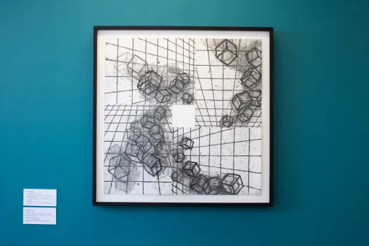
Mel Bochner, Vanishing Point, 1993

Julie Mehretu, Untitled, 2006

How did you come to know about the program and why were you excited about participating?

I was an undergrad here at MIT in the class of 2012 so I probably knew some undergrad students who had borrowed from the Student Lending Art Program. When I looked up the student program, I saw I could have these amazing art pieces in my office, how cool is that!

What drew you to the works you selected? Do they have any common themes?

As soon as I saw Julie Mehretu I was just like ‘that is amazing.’ As an undergrad, I minored in architecture so I am always drawn to the drafting aesthetic and the combination of the geometric shapes and organic pencil drawings. 

For Mel Bochner’s work, I just loved the geometry in it. We do a lot of geometric algorithms in my research group. I was super drawn to the fact that this one in particular looked like a detector in an experiment that I worked on with collaborators that is for crystallography. It actually looks like the panel detector so I was just tickled that not only is it really attractive to me from a geometric perspective but that it also reflected one of the projects that I was working on. 

For the very large piece, which I was so excited that I could fit in my office, that one was just so gorgeous and I loved the juxtaposition of the harder geometric lines with the abstract colors. I really love coming into work because I get to be surrounded by such amazing pieces.

Has the artwork sparked conversation amongst visitors? Do people comment on it when they come into your office?

People are always wondering where I got it from and I’m like ‘you can get it too!’ I think people enter the space and are like ‘woah this is so nice.’ I’ve only been here since August, so getting my office and this environment setup has been a high priority for me. 

Also, I love seeing how people react to the space. People really enjoy it and are not expecting an aesthetic experience when they come into a random professor's office. It seems like it’s challenging what others may think an office can look like. 

Did you learn anything new about the artworks after having some time to live with them? Is there anything you’ve noticed?

I still feel like we’re getting to know each other. I am still reacting to them and thinking about what else needs to be in the room to complement and emphasize them. It certainly has made me want to look up these artists more and understand the context under which these works were created. 

We all bring our own interpretation to viewing art, but it is also so interesting to understand what was going through the artist's mind when they were creating it. I think there's a lot of parallels between when I'm picking a research topic and honing in on what's the question I’m asking. I find that the more I learn about artistic processes, the more I see similarities with the experimentation involved. 

How do you feel these works have affected the space?

I feel like if you were to take these away, the room just wouldn’t work anymore. Their presence in the space makes me so much happier and creative. I feel inspired, I might be thinking of something while I’m looking over the details of the sketches on Julie’s painting. It’s important to get input from something that doesn't seem immediately adjacent to something that you’re doing to push you in the right direction of having an insight. 

Tess Smidt is an an Assistant Professor of Electrical Engineering and Computer Science at MIT. Tess earned her SB in Physics from MIT in 2012 and her PhD in Physics from the University of California, Berkeley in 2018. Her research focuses on machine learning that incorporates physical and geometric constraints, with applications to materials design. Prior to joining the MIT EECS faculty, she was the 2018 Alvarez Postdoctoral Fellow in Computing Sciences at Lawrence Berkeley National Laboratory and a Software Engineering Intern on the Google Accelerated Sciences team where she developed Euclidean symmetry equivariant neural networks which naturally handle 3D geometry and geometric tensor data.