Julia Chatterjee
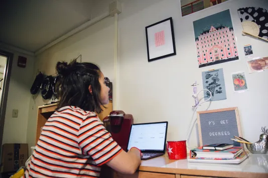
Audra Skuodas
Vibrational Conscilience, 2005
Color serigraph
Gift of Heather and Tony Podesta
CNS.2007.010
Audra Skuodas
Vibrational Conscilience, 2005
Color serigraph
Gift of Heather and Tony Podesta
CNS.2007.010
What drew you to this particular piece?
First, I liked its size. I also noticed that it matched the color scheme of my section of my room. The pale pink and evergreen lines matched my “Grand Budapest Hotel” poster also hanging on my wall.
How did you choose where to display the piece?
I hung it above my desk. In my bedroom at home, my walls are a mosaic of hung items ranging from postcards to a thrifted tennis racket. The wall above my desk is a continuation of this practice. Displaying it among my own posters made the piece feel truly incorporated into my room.
How does the piece interact with your space?
The piece definitely draws people’s attention, but it also makes sense among the items in the room. Its presence in my dorm is similar to the one it had in the gallery when I first saw: it blends in, but once you spot it, it stands out.
What has your experience been like living with the artwork?
Living with the artwork has been a source of inspiration for me. I did some research on the artist, Audra Skuodas, and the ideas behind her work are very intriguing. She portrays the concept of vibrational vulnerability: the invisible phenomenal of incremental cause and effect. Living with this art has introduced me to new ideas that I otherwise would not have encountered.
Do you think that its presence has an effect on you personally?
I watched a video where Skuodas compared art to science because they both are pushing boundaries. I have always been interested in the humanities and the arts, and at a place like MIT, I was nervous I would only focus on technical subjects. I have been happily surprised that there are so many opportunities here that highlight the intersection between science and art. Skuodas’s work helped me locate my interest in these crossroads.
Has the piece had any effect on visitors when they enter your space?
I am very proud that I was lent this piece, so I often point it out to people. The precision and colors within the work create an abstract piece that leaves a lot up to interpretation. I see it as being inspired by the female figure, and this often sparks conversation among my visitors.
What has been most exciting for you in having a professional art work in your living space?
The most exciting part for me has been the trust that having professional art work implied. When I picked up my piece, I literally walked into the museum and took it off of the wall. At most museums, censored wires prevent you from simply standing too close to a piece of art.
What advice would you give to other students hoping to participate in the Student Lending Art Program in the future?
You should totally participate in the Student Lending Art Program. There are so many great pieces that can make dorms feel more like home and inspire new relationships with art. Look for a piece that you personally connect with or find interesting.
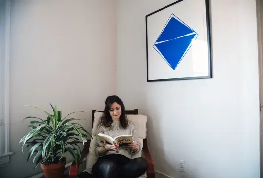
Carmen Herrera
Ariel, 2008
Silkscreen
Purchased with gifts from Brit d'Arbeloff, Karen & Greg Arenson, Karen Ho, Colleen & Howard Messing, John & Cynthia Reed, Sara-Ann & Robert Sanders, Sarah Sarvis & Frederico Milla
CNS.2011.016
What were some things you looked for in a piece while you were making your choices from the collection?
I’m so used to getting just a few minutes with artwork in a museum. I was surprised to find that I looked for very different characteristics when picking out a piece to spend a whole year with. There were some funny text-based pieces and surrealist works that I loved in the gallery but that felt a little overwhelming for a long-term relationship. I thought that pieces with big, bold colors might create a more comfortable, long-term sense of joy.
What drew you to this particular piece?
I liked the clean lines, how even though it’s really simple there’s something new to discover every time you look at it.
How did you choose where to display the piece?
I live in a small Cambridge apartment, and it’s easy for the rooms to feel cluttered. The geometric minimalism of the piece ensures that it always feels clean and comfortable in that corner of the room, at least.
How does the piece interact with your space?
I live in a small Cambridge apartment, and it’s easy for the rooms to feel cluttered. The geometric minimalism of the piece ensures that it always feels clean and comfortable in that corner of the room, at least.
What has your experience been like living with the artwork?
It has been a treat. When I got it, I sent photos to some members of my family. It was really special to hear their reactions – everybody connects with it in a different way.
Do you think that its presence has an effect on you personally?
I find it calming. If I’m stressed or if I need a break from my research, sometimes I’ll just sit on the sofa and enjoy the artwork for a while. It’s a reminder to be grateful for daily interactions with beautiful things.
Has the piece had any effect on visitors when they enter your space?
The piece is definitely the first thing people notice. Sometimes it’s hard to get people to leave the living room. I particularly like sharing it with friends who have pieces of their own, because we can see how similar or different our preferences are—it’s fun to go to a friend’s place and to see a photograph or painting that is amazing, but in a totally different way.
What has been most exciting for you in having a professional art work in your living space?
It’s nice to have a personal connection to this artist and this work – I didn’t know anything about Carmen Herrera when I selected the piece. It wasn’t until I stopped by the List Center to pick it up that one of the staff there told me about this amazing Cuban-American artist whose work had been overlooked for years before she finally found success at age 89. I now seek out her art whenever I can. It feels like I’ve made a new friend.
What advice would you give to other students hoping to participate in the Student Lending Art Program in the future?
Give yourself lots of time to spend in the gallery – there are so many extraordinary pieces in the collection. And tell your friends, because you’ll be able to enjoy the pieces in their living rooms, too.
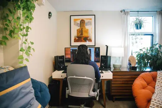
Mary Sherwood
Mnemosyne, 1988
Monoprint
Gift of Dana Friis-Hansen
CNS.1991.001
What were some things you looked for in a piece while you were making your choices from the collection?
At this point in time my place was only half furnished, so I was really looking for something to guide future design decisions. There wasn’t a specific checklist, just a vaguely defined emotional assessment: I had to really want it. I strolled through the gallery three times before making a decision. Part of the fun was busily obsessing over all the details.
What drew you to this particular piece?
I’ve always been a softie for nostalgia, a sense of vastness, etc. For me, the strongest idea from the painting is passage of time. The dominant colors are various shades of rust while the building’s foundation is heavily eroded, yet the building itself still stands. What will fade?
What will remain? After looking it up, I found Mnemosyne to be the perfect name. It’s one the painting shares with the Greek goddess of memory, mother to the nine muses.
How does the piece interact with your space?
I think mid-century modern design does a good job of being thematically clean, allowing other elements to stand out. There’s instead a sense of overgrowth as soon as you enter the apartment due to plants overflowing from every corner and every wall. A planted fish tank with a bonsai moss tree takes center stage. I also have a couple of vaguely Greek busts, pieces of art, and bookends. The painting really drives the image of some civilization’s ruins being reclaimed by nature.
Has the piece had any effect on visitors when they enter your space?
It definitely provides something for the mind to work on a bit. Even though there are lots of plants, foliage is only interesting for so long. Green everywhere simply becomes the background. People visiting for the first time usually mention the painting, comment on its colors, and ask about its origins.
What has been most exciting for you in having a professional art work in your living space?
Haha, definitely displaying original artwork without the associated cost! But with this apartment, I also got to furnish and decorate my own place for the first time in my life. I’ll be here for at least a few more years, and Mnemosyne will always be the first thing I think of when looking back. Wow, look at me getting sentimental about an apartment…am I an adult now?
What advice would you give to other students hoping to participate in the Student Lending Art Program in the future?
Give it a try even if you don’t have any strong feelings about visual art; I certainly didn’t a couple years ago. It’s a free service that is unique to your time at MIT. I’ve personally found appreciation of art to be one of life’s highest benefit to cost activities. Oh, and just like with your children, try to love all your choices equally since it’s a total lottery and some pieces are extremely desired (looking at you, Picasso).
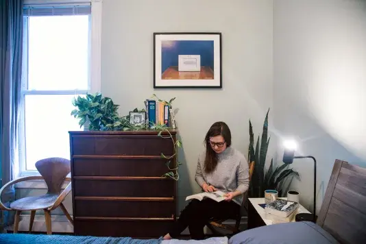
Steve Locke
Untitled (Our Honeymoon-blue), Family Pictures, 2015
Epson Ultrachrome K3 pigment ink
Purchased with funds from MIT Friends of Boston Art
L.2017.001
What were some things you looked for in a piece while you were making your choices from the collection?
I wanted to find something that would grow with me in my last year at MIT. I knew that I would be spending many hours alone, researching and writing and lying awake fretting over my thesis, and I was looking for a piece that I could have a conversation with as my own work progressed.
What drew you to this particular piece?
At first glance the piece seems unassuming. A photograph of a framed picture perched on a wooden table against a serene blue background. The layers unfold, though, first with the phrase “Our Honeymoon,” written in a cursive script, opposite a pair of beach sandals. Rather than the anticipated romantic image – a vacationing newlywed couple – the frame bounds the iconic diagram of a slave ship. This commercialized, contemporary mode for displaying domestic bliss embeds, instead, a historic representation of oppression. I’ve found some of these same themes in my research on popular media representations of incarceration, and I appreciate that this piece challenges its viewers to engage with their own culpability.
How did you choose where to display the piece?
Because the work invites close, intentional viewing, I chose to nest it in my living space. It hangs in my bedroom, and I think that this placement serves to foreground the fraught relationship between domesticity and complicity at the center of the work. In particular, it hangs on my blue bedroom wall above a wooden dresser, mimicking the piece’s own composition.
What has your experience been like living with the artwork?
The piece begins and ends each of my days. In the morning, it reminds me to be intentional about my choices, and, in the evening, it reminds me to reflect on how I navigate the world around me. It doesn’t matter if I’m overwhelmed or running late or exhausted – I am always moved to interact with it.
Do you think that its presence has an effect on you personally?
I chose this work precisely because of the effect it has on me personally. It makes a stark, jarring juxtaposition, which, for me, has been generative and critical in these final months at MIT.
What advice would you give to other students hoping to participate in the Student Lending Art Program in the future?
Pick pieces that speak to you! Whether they challenge you, like Untitled (Honeymoon – blue) challenges me, or if they simply inspire joy when you look at them, or anything in between.